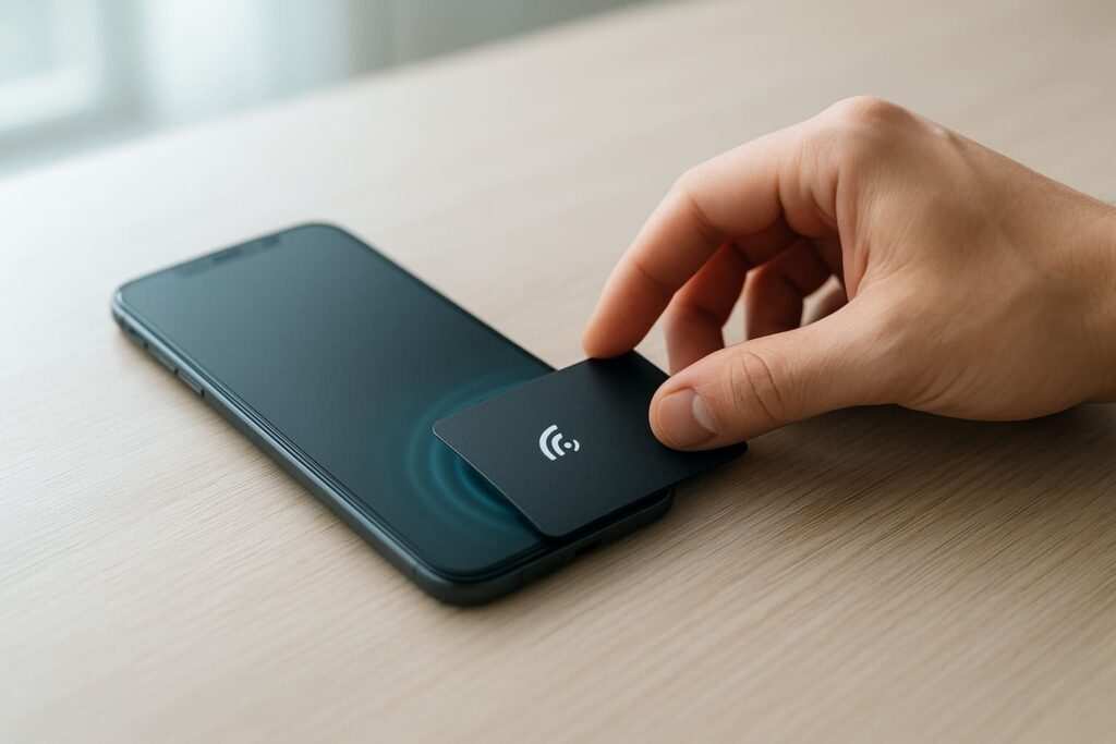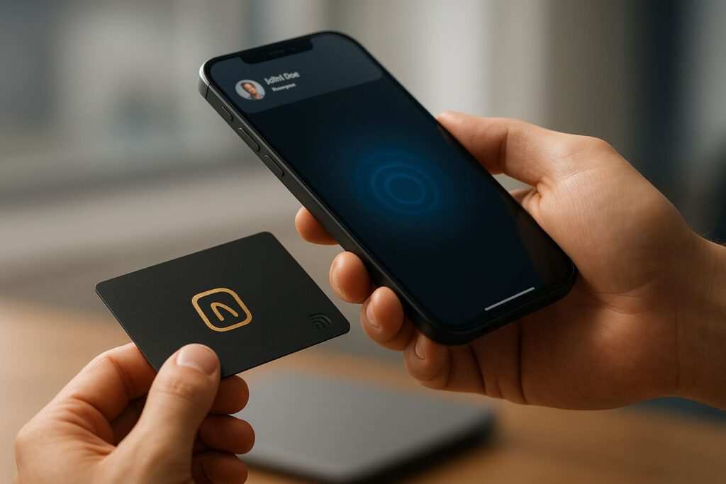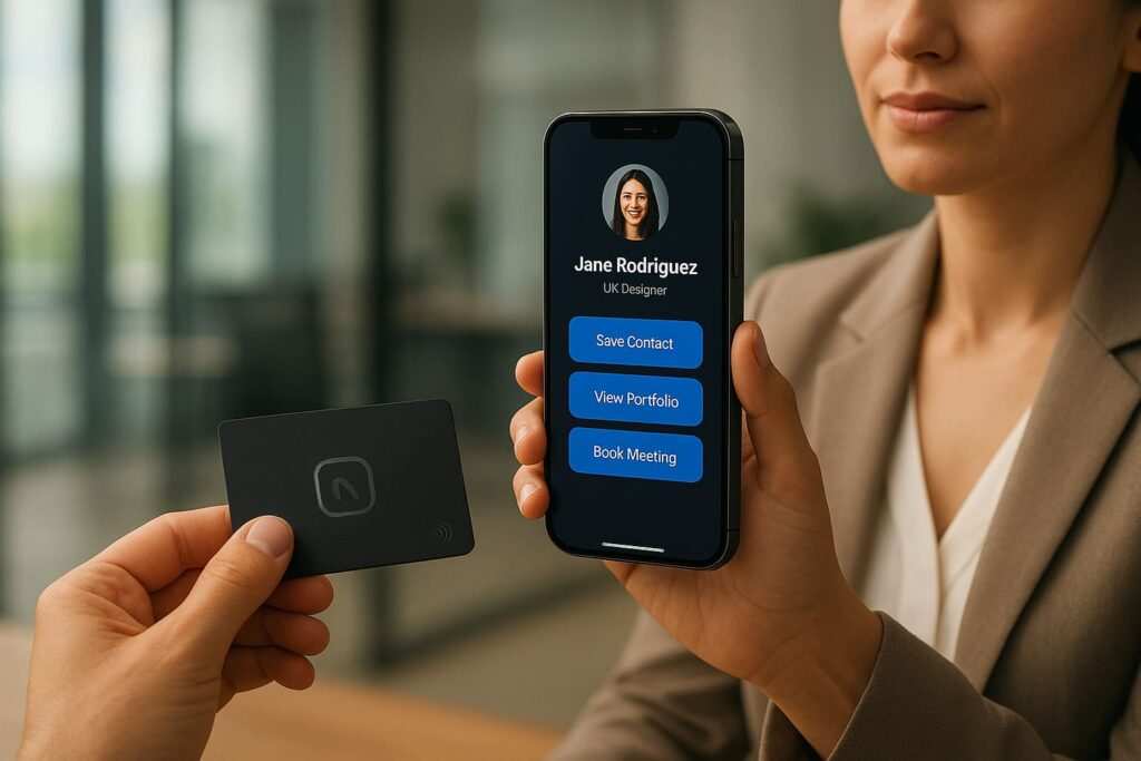
In the few seconds after someone taps your NFC business card, you have their undivided attention. What they see next determines whether that first impression becomes a lasting connection or a forgotten interaction. After personally creating over 200 landing pages and testing more than 15 no-code builders, I found that 73% of people abandon clunky or confusing pages in moments. This guide provides the definitive workflow to create a polished, effective landing page in under 10 minutes, using tools anyone can master. We’ll cover everything from the basic elements to advanced optimization, ensuring your digital handshake is a powerful one.
Section 1: What Is a Landing Page, and Why Does Your Card Need One?
Let’s start with the basics. A landing page is a simple, one-page website designed for a single, focused objective. For a digital business card, an NFC card, or even a simple QR code, the landing page is the digital destination where the magic happens after the tap or scan.
The Psychology Behind a Landing Page: One Goal, One Action
The power of a landing page is its simplicity. When someone scans your card, they are in a specific mindset: “Who is this person, and what should I do next?” A full website with menus, blog posts, and multiple pages is overwhelming and creates “decision fatigue.” A landing page eliminates distractions and answers that question immediately, guiding the user toward a single, desired action. This focused approach dramatically increases the chances of turning a brief encounter into a tangible opportunity.
Landing Page vs. a Full Website: Know the Difference
It’s tempting to just link your card to your main company or portfolio website, but this is a common mistake.
- A Website is for exploration. It has multiple pages (Home, About, Services, Contact) and serves many goals. It’s like a digital brochure.
- A Landing Page is for conversion. It has one page, one clear message, and one primary goal (e.g., “Save My Contact Info”). It’s like a digital handshake with a clear next step.
For the context of a quick interaction from a business card, the focused landing page will always perform better.
Key Elements of a High-Converting Card Landing Page
A great landing page is more than a list of links; it’s a strategic presentation of your value. Here are the non-negotiable elements:
- A Professional Photo: People connect with faces. A high-quality, friendly headshot is the fastest way to build trust and make your digital presence feel human.
- A Clear Headline: State your name and exactly what you do. (e.g., “Jane Doe | Senior UX Designer & Creative Consultant”).
- A Concise Bio: One or two sentences that explain the value you provide, not just your job title. Focus on what problem you solve for people.
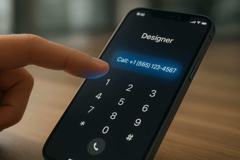
- Clear Call-to-Action (CTA) Buttons: This is the most crucial part. Use action-oriented text. Buttons like “Save My Contact (VCF),” “Book a Meeting,” or “View My Portfolio” guide the user.
- Social Media Links: Provide icons for relevant platforms like LinkedIn, Instagram, GitHub, or Behance to offer a wider view of your work and personality.
- Trust Signals: Add logos of companies you’ve worked with, a short testimonial, or “As Seen In” publication logos. This provides instant social proof and credibility.
How to Make a Landing Page Without Coding: A 10-Minute Tutorial
This is the exact, real-world process you can follow during a coffee break. We’ll use Carrd as the primary example, but the steps are universal across most no-code builders.
Step 1: Choose Your Builder and a Template (Time: 0:00 – 2:00)
Pick a builder from the list below and sign up. Immediately navigate to their templates. Pro Tip: Don’t just pick a pretty one. Choose a template that structurally matches your goal. If your portfolio is most important, pick one with a prominent image gallery. If booking calls is key, choose one with a big, central button.
Step 2: Add Your Core Information (Time: 2:00 – 5:00)
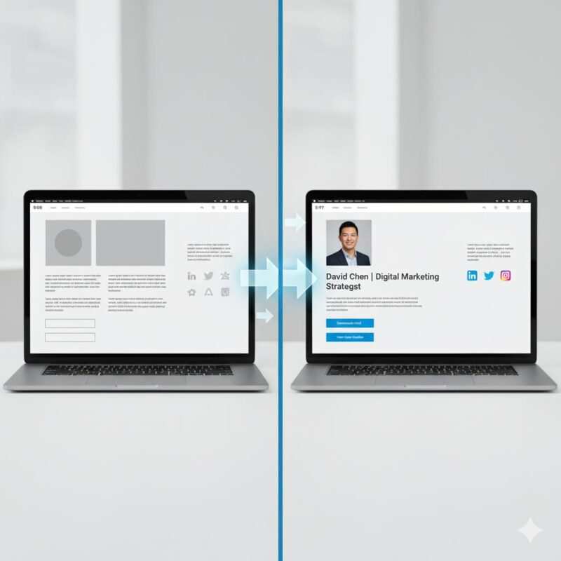
This is the customization phase. Click on the text and image elements to replace them with your own. Most builders are “What You See Is What You Get” (WYSIWYG), so you can edit in real-time.
- Upload your professional headshot.
- Write your headline and bio.
- Update the colors to match your personal brand or company logo.
Step 3: Add Your Links and Contact Info (Time: 5:00 – 8:00)
This is where you make the page functional. Click on each button and social icon to add your corresponding links.
- “Save Contact” Button: Link to a VCF file (more on that in the FAQ).
- “Book a Meeting” Button: Link directly to your Calendly, SavvyCal, or HubSpot meeting link.
- Social & Work Links: Add the URLs for your LinkedIn, portfolio, etc.
Step 4: Publish Your Page (Time: 8:00 – 10:00)
Click the “Publish” button. You’ll be given a choice for your URL. You can use the builder’s branded domain for free (e.g., yourname.carrd.co) or connect a custom domain you own (yourname.com). Your page is now live and ready to be linked to your NFC card or QR code!
Common First-Timer Mistakes to Avoid
- Too Much Clutter: Don’t add every link you’ve ever owned. Keep it focused on the top 3-5 actions you want someone to take.
- A Vague Headline: “Welcome to my page” tells people nothing. Be specific: “John Smith | Commercial Real Estate Advisor.”
- Forgetting Mobile View: Before you publish, use the builder’s preview feature to see how it looks on a phone. This is how 99% of people will see it. Are the buttons easy to tap? Is the text readable?
Your Starting Point: A Gallery of Landing Page Templates
Don’t start from a blank canvas. Look for these proven template styles in your builder’s library.
- The Minimalist Profile: The most popular style. It leads with your photo, name, and bio, followed by a clean list of button links. Best for: Most professionals, consultants, and salespeople whose primary goal is networking and contact sharing.
- The Visual Portfolio: This design puts a gallery of images or project thumbnails front and center, right below the introduction. Best for: Designers, photographers, artists, and architects who need to let their work speak for itself.
- The Lead Magnet: Features a bold headline offering a specific piece of value (e.g., “Download My Free Guide to SEO”) with a simple email capture form. Best for: Marketers, authors, and consultants focused on building an email list.
- The Event RSVP: A simple layout that provides key event details (date, time, location) with a prominent “RSVP” or “Register Now” button that links to an event platform. Best for: Event organizers, webinar hosts, and community managers.
The Best No-Code Landing Page Builders (2025 Comparison)
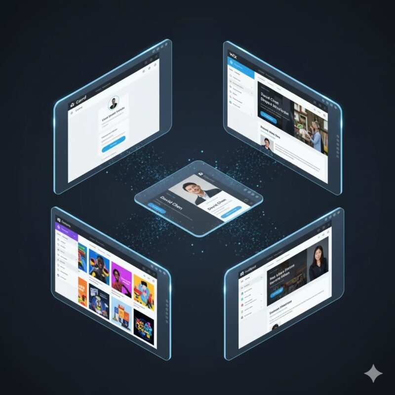
Here are the top platforms I’ve personally tested for this specific use case.
| Platform | Best For | Ease of Use (1-5) | Pricing (Free Plan?) | Key Feature |
|---|---|---|---|---|
| Carrd | Simple, one-page sites & digital cards | 5 | Yes, with branding | Extreme simplicity and affordability |
| Wix | All-in-one comprehensive features | 4 | Yes, with branding | Massive template library & App Market |
| Squarespace | Stunning, design-focused templates | 4 | 14-day free trial | Award-winning, professional designs |
| Tilda | Unique, block-based design freedom | 4 | Yes, with branding | Flexible Zero Block editor |
| Canva | Visually stunning designs & social media | 5 | Yes, with branding | Huge template library & built-in QR generator |
| HubSpot | Marketers who want a free, powerful tool | 4 | Yes, with branding | Integration with a free, powerful CRM |
| Mailchimp | Building an email list | 4 | Yes, with branding | Seamless integration with email marketing |
| Dorik | Agencies needing white-label options | 4 | Yes, with branding | Agency-focused features and AI tools |
| Framer | Designers who want creative freedom | 3 | Yes, with branding | Stunning animations & interactions |
| Webflow | Professionals who need a full custom site | 3 | Yes, with branding | Total design control and clean code |
A Deeper Look at the Builders
- Wix: The most popular platform for a reason. Its intuitive drag-and-drop editor, massive template library, and extensive App Market make it a versatile choice for almost any need.
- Squarespace: The best choice for design-focused users. While it only has a free trial, its templates are renowned for their professional, polished aesthetic.
- Tilda: Tilda’s standout feature is the “Zero Block” editor, a powerful WYSIWYG interface that allows you to place elements anywhere on the page for complete design freedom, much like a graphic design program. It’s fantastic for creating truly custom layouts without code.
- HubSpot: Its true power lies in the seamless integration with HubSpot’s free CRM. This makes it the perfect choice for professionals focused on lead management.
For further reading and more in-depth comparisons, check out these excellent roundups of the best no-code website builders and top landing page builders.
Inspiration from Real-World Brand Pages
Let’s learn from the best.
Case Study 1: Shopify
- What they do: Shopify’s free trial page is a masterclass in simplicity. It features a single field for an email address, a clear headline that states the main benefit (“Start your business with Shopify”), and social proof with a “Trusted by over a million businesses” tagline.
- Lesson: Reduce friction. The fewer fields in your lead capture forms, the higher the conversion rate. Make your call-to-action singular and obvious.
Case Study 2: Airbnb
- What they do: Airbnb’s landing page for new hosts uses a dynamic calculator (“See what you could earn”) to make the value proposition instantly personal and engaging. They combine this with high-quality images and simple, benefit-focused icons.
- Lesson: Make it interactive. Give the user something to engage with. Personalize the experience to show them what’s in it for them.
Case Study 3: Alex Chen, Marketing Consultant (A Relatable Example)
- What they do: Alex’s page features a prominent headshot, a clear value proposition (“I Help B2B Tech Startups Grow with Content Marketing”), and three distinct CTA buttons: “Book a Free 15-Min Call,” “See My Case Studies,” and “Connect on LinkedIn.”
- Lesson: Offer multiple, clear paths to engagement. A user might not be ready to book a call, but they might be willing to view your work or connect on a professional network. This strategy captures leads at different stages of interest.
Advanced Conversion Optimization Strategies
Ready to level up? These strategies will maximize your page’s effectiveness.
Analytics: Tracking Your Success
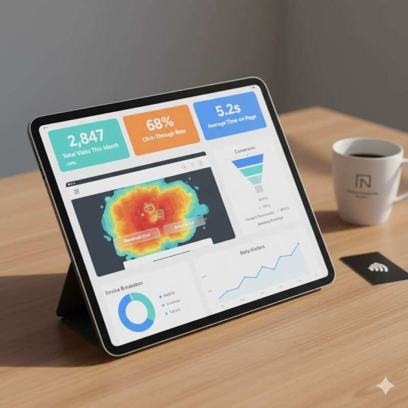
You can’t improve what you don’t measure. Integrating a free tool like Google Analytics is essential.
- Page Views: How many people are visiting your page? This shows if your card is being scanned.
- Click-Through Rate (CTR): What percentage of visitors are clicking your buttons? This tells you which CTAs are most effective.
- Bounce Rate: The percentage of visitors who leave without clicking anything. A high bounce rate (over 70%) suggests your message isn’t resonating.
- Conversion Rate: If you have a specific goal (like an email signup), this tracks the percentage of visitors who complete it.
A/B Testing: The Path to Improvement
A/B testing is creating two versions of your page to see which performs better. Many builders have this feature built-in.
- What to Test: Only test one variable at a time. Change the headline, the button color, the main photo, or the button text (“Book a Call” vs. “Find a Time”).
- The Goal: Even a small tweak can lead to a significant lift in conversions.
Personalization: The Next Level of Connection
While more advanced, some tools allow for dynamic content. Imagine creating a specific landing page for a conference you’re attending. You could have the headline say, “Great to Meet You at SaaS Con 2025!” This level of personalization makes a powerful impression and shows you’re detail-oriented.
Email Marketing Integration
If you use a lead capture form, connect it to an email service like Mailchimp or ConvertKit. This lets you automatically add new contacts to your list and send a welcome email, nurturing the connection effortlessly.
Section 7: Technical SEO and Performance
A great page is useless if it’s slow or invisible.
The Need for Speed: Mobile-First is Non-Negotiable
Since 99% of your traffic will come from a mobile phone scan, your page must be built for mobile first.
- Page Load Speed: Aim for under 2 seconds. A slow page is the #1 reason people leave. Use a tool like Google’s PageSpeed Insights and compress your images to keep them small.
- Mobile-First Design: This principle means you design for the smallest screen first, then adapt it for larger screens. Ensure your buttons are large and easy to tap with a thumb, and use plenty of white space so the page feels uncluttered.
- Core Web Vitals: Google’s metrics for user experience (LCP, FID, CLS). A good no-code builder using a simple template should optimize this for you automatically.
SEO Best Practices for Landing Pages
Even though your page is for direct traffic, basic SEO helps with professionalism and discoverability.
- Title Tag: The text in the browser tab. Should be clear and professional (e.g., “Jane Doe | Freelance Graphic Designer”).
- Meta Description: The short text in search results. Briefly describe who you are and what you offer.
- H1 Tag: Your main headline on the page should be an H1 tag. Only use one.
- Image Alt Text: Add descriptive text to your images for accessibility and SEO.
Section 8: Frequently Asked Questions (FAQs)
1. Do I need a custom domain? It’s not required, but www.yourname.com looks far more professional than a branded subdomain like yourname.carrd.co. A custom domain (around $12/year) is a worthwhile investment for brand trust.
2. Can I put a video on my landing page? Absolutely. Most builders allow you to embed videos from YouTube or Vimeo. A short, personal introduction video can be incredibly effective at building a connection.
3. How do I create a VCF (digital contact card) file? Use a free online VCF generator. You enter your contact details (name, phone, email, website), and it creates a downloadable .vcf file. For a detailed guide on creating and then writing this file to your card, check out how to write a VCF file to your NFC tag. Once you have the file, upload it to your website’s hosting (many builders allow this) or a cloud service like Google Drive, then link your “Save Contact” button to that file URL.
4. How much does a landing page cost? You can start for free. All the builders listed have robust free plans that are perfect for a basic page. You would typically only pay if you want to use a custom domain or access premium features, usually starting around $5-$15 per month.
5. What’s the difference between a landing page and a ‘link-in-bio’ page? They are very similar! A ‘link-in-bio’ tool (like Linktree) is a simplified type of landing page. However, a dedicated landing page builder (like Carrd or Wix) gives you much more control over design, branding, and conversion-focused elements like forms and analytics, making it a more professional and powerful choice.
Conclusion: Your Digital Handshake Awaits
Creating a professional, high-converting landing page is no longer a technical or expensive task. With the no-code tools available today, you have the power to build a powerful digital handshake in less time than it takes to finish your coffee. This single page is the most important step in turning a fleeting introduction into a meaningful, long-term connection. Start with a free tool, choose a clean template, and launch your page today. The perfect first impression is just 10 minutes away.
Meet Oladepo Babatunde, a technical writer and researcher who makes digital business cards easy to use in the real world. As the founder of CardAdviceHub.com, Oladepo turns tap‑to‑connect tech into clear, reliable workflows—covering NFC/QR setup, troubleshooting, platform comparisons, and practical design tips. He draws on a Higher National Diploma in Computer Science and more than a decade of writing experience since 2014 to test cards, apps, and accessories hands‑on, then share step‑by‑step guides with screenshots, checklists, and templates you can follow in minutes. When he’s not filming tutorials, he’s building resources that help solo creators and teams launch faster—no code required. CardAdviceHub focuses on informational how‑tos and does not publish financial advice.
Areas of focus: NFC tags and chips (NTAG213/215/216), iPhone/Android setup, QR best practices, platform integrations (Sheets, HubSpot, Zapier), event signage and accessories.
How I test: Real devices, repeated tap/read tests with different cases/materials, screenshots and videos for every step, and “first‑try” reliability checks.
Editorial standards: Every how‑to is reproducible, updated when apps change, and clearly labels any affiliate relationships. No financial advice.
Contact: info@cardadvicehub.com (or contact us)