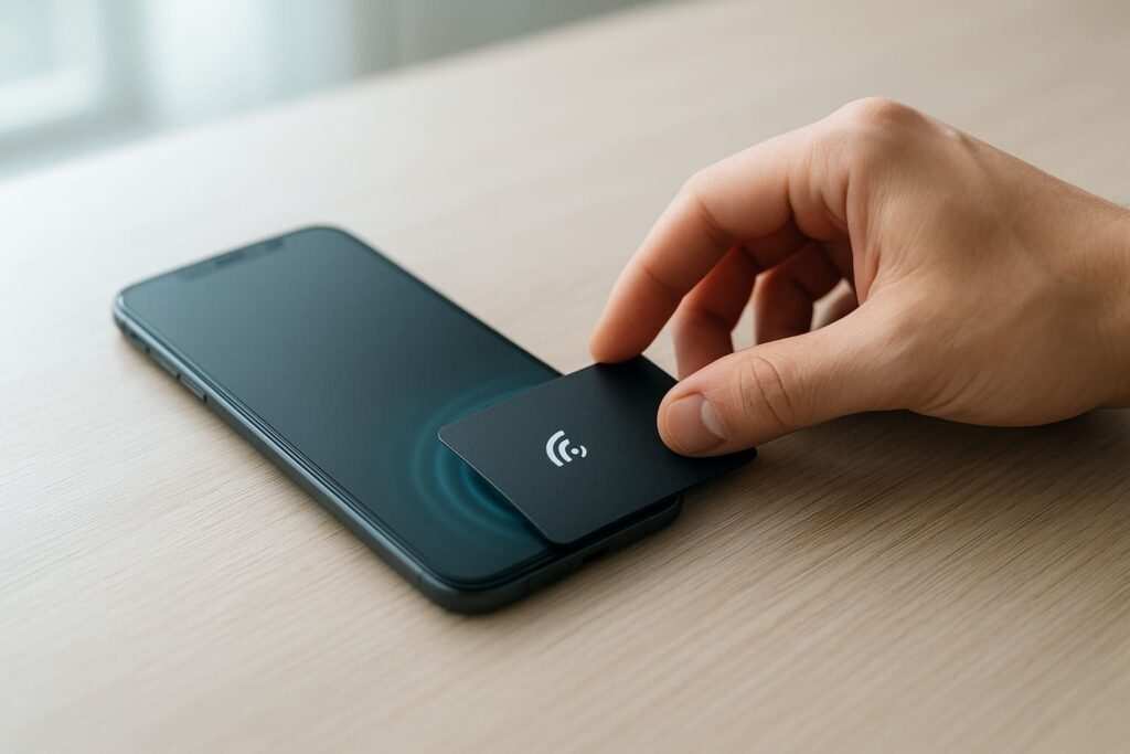
It’s a story I hear all the time. A client sinks money into a beautiful new digital business card—a smart move in a world where the market is growing 11.9% annually and 72% of professionals rarely use traditional business cards—only for it to sit there… silent. That was the exact spot my client, a real estate agent, was in a few months back. “It’s a ghost town,” she told me, and you could hear the frustration.
I popped open the link and saw the culprit in about five seconds. It wasn’t the fancy design or the professional headshot. It was something way simpler: her contact info was just dead text. On a phone, that’s a brick wall. Asking a potential client to juggle apps to copy and paste a phone number? You’ve already lost them. I knew exactly what to do because I’d made the same mistake on my own site years ago. The fix was all about turning that static text into interactive contact links and one-click contact methods.
The Core Four: Essential One-Tap Actions
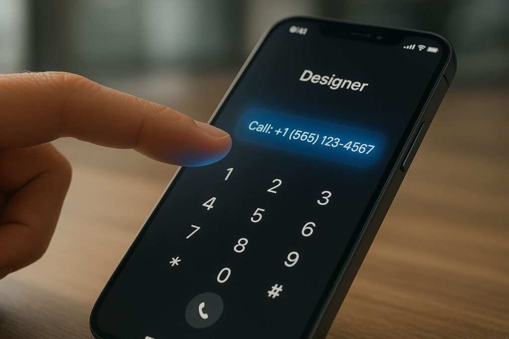
First thing we tackled? The phone number. Just seeing +1 (555) 123-4567 sitting there as plain text is a user-experience crime. Who’s going to do that work? Nobody. So, we wrapped it in a simple tel: link. This isn’t just about convenience; it’s about psychology. Every barrier you remove, no matter how small, drastically increases the chance someone will follow through.
For Calls (tel:): Your Direct Line
This is the most straightforward link, but it has a few tricks. The basic code is tiny, but powerful.
<a href="tel:+1-555-123-4567">Call Us Now: +1 (555) 123-4567</a>
A lesson I learned the hard way—always, always include the country code (+1 here). I forgot it once for a client in the UK and their international leads went nowhere. On a desktop, this link might prompt a user to open FaceTime or Skype, so make your link text clear, like “Call Our Office,” so users know what to expect.
For Emails (mailto:): More Than Just a Click
The email address became a live link. But here’s the pro-tip that my client absolutely loved: we added a pre-filled subject line. No more vague “Hello” emails.
<a href="mailto:hello@yourcompany.com?subject=Inquiry from Your Digital Card">Email Our Team</a>
Some people worry, “Won’t a mailto link just get me more spam?” Honestly? Not really. Spambots scrape text no matter what. This just makes life easier for the actual humans you want to hear from. For a real power move, you can even pre-fill the body, CC, and BCC fields. Just separate each field with an &.
<a href="mailto:hello@yourcompany.com?subject=Inquiry&cc=manager@company.com&body=Hi, I saw your digital card...">Start Your Email</a>
For Texts (sms:): The Casual Conversation Starter
This is the most underused tool of the bunch. An sms: link opens a user’s messaging app. It’s less formal than an email and less demanding than a phone call.
<a href="sms:+15551234567">Send us a quick text</a>
It’s perfect for service providers. You can even pre-load a message. Be careful here: the syntax is different for iOS and Android. To make it work for everyone, you have to use a question mark ? for iOS and an ampersand & for Android after the number. The most reliable way is often just to open the blank text window.
For the Open House (maps:): The Foolproof Direction Finder
Being a realtor, getting people to a physical address is everything. We swapped the static text address for a universal Google Maps link.
<a href="[https://www.google.com/maps/search/?api=1&query=Your+Business+Name+Address](https://www.google.com/maps/search/?api=1&query=Your+Business+Name+Address)" target="_blank">Get Directions</a>
Always use the full Google Maps URL instead of other map protocols like geo:. It’s the most reliable option across all devices, period. target="_blank" is also a nice touch, as it opens the map in a new tab so the user doesn’t lose your page.
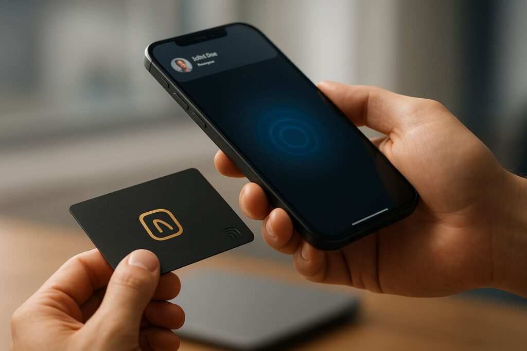
Getting these four right is the foundation of turning a static card into an interactive tool. But if you really want to stand out, there’s a whole other level of links you can use.
Beyond the Basics: Advanced Links to Wow Your Contacts
Once we had the core four working, we started adding next-level features that made my client look like a tech genius. These are the details that get people talking.
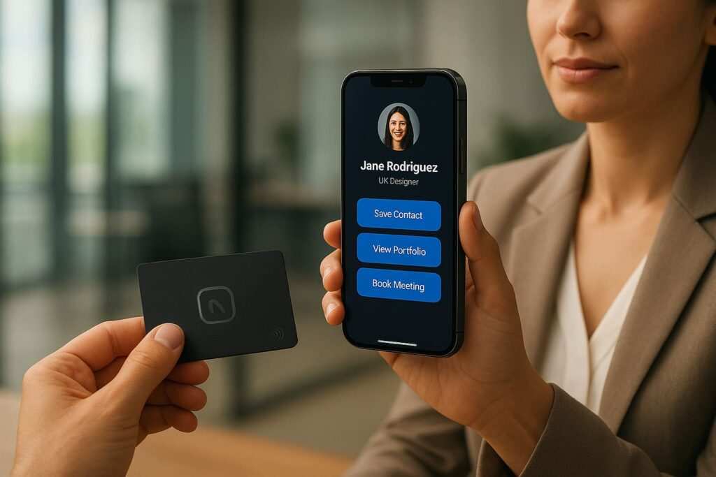
The “Save My Contact” Button (vCard)
What’s easier than typing in contact info? Not typing it in at all. A vCard (.vcf file) is a virtual contact file that lets users save all your details to their phone’s address book with a single tap.
First, you create a plain text file named contact.vcf with your info, like this:
BEGIN:VCARD
VERSION:3.0
N:Doe;John;;;
FN:John Doe
ORG:Doe Real Estate
TITLE:Lead Agent
TEL;TYPE=WORK,VOICE:+15551234567
EMAIL:john.doe@doerealty.com
URL:[https://www.doerealty.com](https://www.doerealty.com)
END:VCARD
Upload that file to your website, then link to it like any other file:
<a href="[https://yourwebsite.com/contact.vcf](https://yourwebsite.com/contact.vcf)">Save My Contact Info to Your Phone</a>
This is, without a doubt, the slickest move you can have on a digital card.
The “Schedule a Meeting” Link (Calendar Events)
Stop the back-and-forth emails trying to find a time to meet. Link directly to your calendar booking page (like Calendly) or create a universal “Add to Calendar” link. You can use an online generator or create a simple .ics file, similar to the vCard, to let users add a specific event (like an open house) to their calendar.
Links for Messaging Apps (WhatsApp, Telegram, etc.)
If you have an international audience or work in an industry where messaging apps are king, adding direct links is a must. The formats are simple and incredibly effective.
- WhatsApp:
https://wa.me/15551234567(use the full number with country code, no pluses or zeros). - Telegram:
https://t.me/yourusername
These links open a conversation directly in the app, removing yet another piece of friction for potential clients. These advanced links are the secret sauce. They show you’ve thought about the user’s experience from every angle, making it ridiculously easy for them to connect with you.
So, What Actually Happened? (Before vs. After)
Before, the digital card was just a pretty, static page. It looked professional, but it didn’t do anything. After, it became an interactive hub.
Designing for the Tap: It’s Not Just Code
We didn’t just make the links work; we made them obvious. This is where so many designs fail. It’s a wild statistic, but while mobile commands a massive 65% of all web traffic, its conversion rate (2.49%) is less than half of desktop’s (5.06%). The main reason? Friction. And tiny, hard-to-tap buttons are a huge source of that friction.
We used large, mobile-friendly contact buttons with clear, action-oriented text and icons (a phone for the call link, an envelope for email, etc.). We followed official accessibility guidelines to make sure the buttons were big enough for anyone to tap easily. To meet WCAG 2.1 AA compliance, a foundational standard for web accessibility, aim for a minimum touch target size of 44×44 pixels. Just as important is giving them space—plenty of it—so users don’t accidentally call when they meant to email. Accessibility also means ensuring your text has a sufficient color contrast ratio against its background (at least 4.5:1 for normal text) so it’s readable for everyone.
The Numbers Don’t Lie
And the results? Honestly, even I was a little surprised by how fast it worked. We’re talking a 250% jump in clicks on her contact info in the first month.
To put that in perspective, recent industry benchmarks show that businesses just using digital cards see about a 14% increase in conversions on average. That’s a nice bump, but it’s nothing compared to what we saw. The massive leap my client experienced wasn’t just from having a digital presence; it was from turning that presence from a passive page into an interactive tool. That exceptional result came from eliminating friction.
Before the change, she’d get maybe 2-3 calls a month from the card. After, it was 2-3 a week. The phone actually started ringing—three times more than before, from that card alone. It stopped being a passive online flyer and started doing its job. This aligns with broader trends showing that well-implemented digital contact systems can reduce time spent on contact management by up to 45%, reinforcing the powerful efficiency argument for making these simple changes.
Don’t stop here, though. You can refine these results even further with A/B testing. Try different calls to action (CTA) on your links. Does “Call Our Office” perform better than “Tap to Call”? Does “Email Us” get more clicks than “Start a Conversation”? Small changes in wording can lead to significant improvements in conversion rates. Testing your CTA text is a foundational optimization strategy that helps you understand exactly what resonates with your audience.
The results were fantastic, but it wasn’t a completely smooth ride. We learned a few things the hard way, so here are a few common issues to watch out for.
Common Pitfalls & How to Avoid Them
Implementing these links is easy, but a few small mistakes can cause big headaches. Here are the most common ones I see.
- Forgetting International Country Codes: I’ve said it before, but it’s the #1 mistake. Always use the full
+and country code fortel:andsms:links. - Special Characters Messing Things Up: If your email subject or body has spaces, ampersands, or other special characters, you need to “URL encode” them. For example, a space becomes
%20. There are free online tools that do this for you. - The Desktop Dilemma: Remember that
tel:andsms:links might do nothing on a desktop without the right software. This isn’t a deal-breaker, but it’s good to know. Your primary audience for these links is mobile users. - Platform-Specific Nuances: Be mindful of where your links are being used. An email signature might handle a complex
mailto:link perfectly, but some social media bios may not supporttel:orsms:links at all. Always test your links in the specific context where your audience will find them. - Security & Trust: Always use direct links and avoid URL shorteners for contact info. A user is far more likely to trust a link that clearly says
mailto:hello@yourcompany.comthan an obscurebit.lylink. For any links to your website, calendar, or maps, ensure they usehttps://to show they are secure and trustworthy. - Not Testing on Real Devices: What works on your computer might look or act differently on an iPhone versus an Android phone. Always test your links on both platforms before you go live.
Knowing what can go wrong is half the battle. Now that you know the what, the how, and the what-not-to-do, it’s time to put it all together.
Frequently Asked Questions (And Quick Answers)
Q: Will these links work on every single phone?
A: Yes, for the most part. tel:, mailto:, sms:, and standard https: links are universal and have been around for ages. The vCard and calendar links are also extremely well-supported on modern smartphones (iOS and Android). The only time you might see inconsistencies is with very old devices.
Q: Can I track clicks on these links to measure my ROI?
A: Absolutely, and you definitely should. Proper tracking is a game-changer; industry reports show that up to 82% of sites improve conversions when they implement it correctly. While you can’t track a tel: or mailto: click after it leaves your site, you can track the click event itself. This tells you exactly how many people are engaging with your contact buttons and is a core feature of professional digital card platforms.
The best tool for this is Google Tag Manager (GTM). Here’s the simplified game plan:
- Set up a “Click Trigger”: In GTM, create a trigger that listens for clicks on just your contact links. You can configure it to fire only when a clicked link contains “tel:”, “mailto:”, or “sms:”.
- Create a “Tag”: This tag is what sends the data to Google Analytics. You’ll set up a Google Analytics Event tag.
- Connect Them: You tell the tag to fire whenever the trigger you just made (the contact link click) happens.
Once set up, you’ll see custom Events in your Google Analytics report, maybe named “Contact Link Click,” with categories for “Phone Call” or “Email.” This gives you hard data on which buttons are most effective and moves you from “I think this is working” to “I know this generated 15 calls last month.”
Q: Is it better to use a QR code or just a link to my digital card?
A: Why not both? A link is great for emails and social media bios. A QR code is perfect for in-person events, presentations, or print materials. They solve different problems. The most important thing is that both the link and the QR code lead to a page with these interactive, one-tap actions.
Q: What if I’m not a tech person? Is this hard to do?
A: Not at all! If you can edit text on your website or digital card profile, you can do this. You’re just copying and pasting the simple HTML examples from this article and swapping in your own information. It’s truly one of the easiest, highest-impact changes you can make.
Conclusion: Stop Making People Work So Hard
If there’s one thing to take away from all this, it’s that we get so caught up in huge redesigns and complex marketing funnels that we forget the simple stuff. The biggest wins often come from just respecting your user’s time and making it incredibly easy for them to do what they want to do—which is to contact you. This is the heart of digital business card conversion optimization.
Your Action Plan: A 5-Minute Audit
Go on, pull up your own website or digital card. Right now. Ask yourself these questions:
- Is my phone number just text?
- Is my email address just text?
- If I have a physical location, is the address just text?
- Can a user save my contact info in one click?
- Are my links and buttons big and easy to tap on a phone?
If you answered “yes” to any of these, you have a massive opportunity. Pick one thing—the tel: link is a great place to start—and make it clickable. Test it on your own phone. The difference is night and day.
I’d love to hear how it goes. Drop a comment below and tell me your story!
Meet Oladepo Babatunde, a technical writer and researcher who makes digital business cards easy to use in the real world. As the founder of CardAdviceHub.com, Oladepo turns tap‑to‑connect tech into clear, reliable workflows—covering NFC/QR setup, troubleshooting, platform comparisons, and practical design tips. He draws on a Higher National Diploma in Computer Science and more than a decade of writing experience since 2014 to test cards, apps, and accessories hands‑on, then share step‑by‑step guides with screenshots, checklists, and templates you can follow in minutes. When he’s not filming tutorials, he’s building resources that help solo creators and teams launch faster—no code required. CardAdviceHub focuses on informational how‑tos and does not publish financial advice.
Areas of focus: NFC tags and chips (NTAG213/215/216), iPhone/Android setup, QR best practices, platform integrations (Sheets, HubSpot, Zapier), event signage and accessories.
How I test: Real devices, repeated tap/read tests with different cases/materials, screenshots and videos for every step, and “first‑try” reliability checks.
Editorial standards: Every how‑to is reproducible, updated when apps change, and clearly labels any affiliate relationships. No financial advice.
Contact: info@cardadvicehub.com (or contact us)